Kiwi Design System
The Brief
Rearchitecting the RSS UI infrastructure for long-term scalability
To build software that keeps people safe on the job, our internal product teams need to work quickly and stay aligned. However, as our suite of safety applications grew, keeping our design documentation in Zeroheight synced with actual production code became a major headache for both designers and engineers.
To fix this, I led the migration of the Kiwi Design System over to Storybook. Our goal was to move away from static guidelines and create a single, living source of truth. By auditing our library and building reusable, scalable components, we closed the gap between design and engineering — ultimately saving development time and ensuring a more consistent, reliable experience for our users.
Context
Discover & Define
I wanted to understand where things were breaking down, for both our internal teams and our customers. The designer before me had kept all the guidelines and best practices in Confluence, so a big part of this was going through that backlog piece by piece: keeping what still held up, and cutting what had gone stale as the components changed.
Understanding people and scope
In the 120-people company, I had the opportunity to conduct internal interviews, gathering data from developers, QA leads, and product owners to understand what their pain points were. I worked with the customer-facing teams to understand what were frequent issues our clients brought up.
“There’s always inconsistency across screens, across products. It’s not even just our legacy apps, it’s our current products. When our clients ask or point it out, I don’t know what to say at times.”

“We are looking to the design team to provide clear guidelines on different states of any component, and to account for edge cases.”

“I’m not sure which asset to use at times, so I often feel like I have to wait for a team meeting for me to float up my questions.”

Process
How might we
create a sustainable design system that is applicable for all the products, both legacy and current?
How might we
deliver a clear guideline to developers so that we may limit misalignment and miscommunication between design and dev teams?
How might we
organize, structure, and publish the design system for easy visibility and readability?
The Solution
Foundations: one source of truth
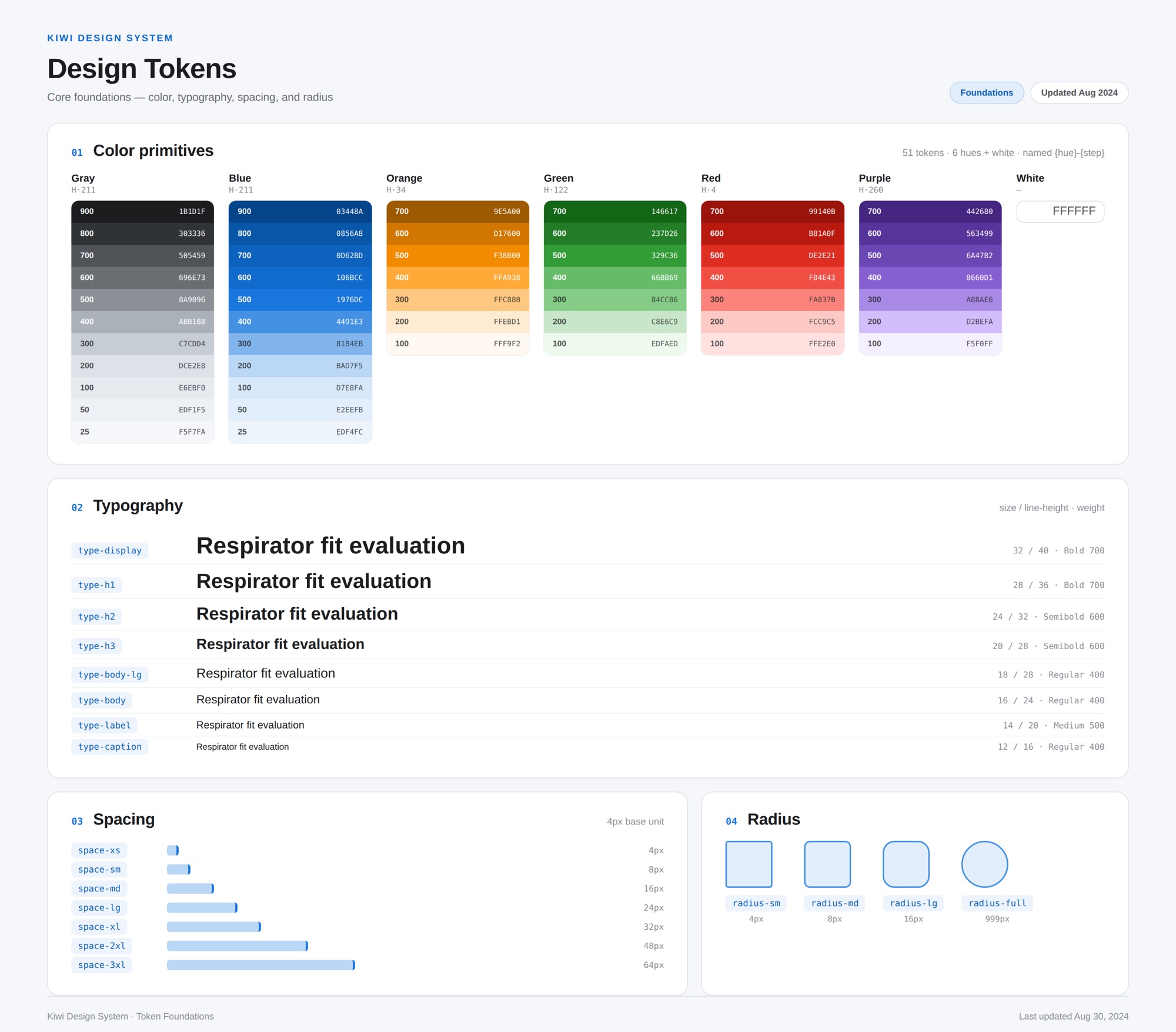
The system starts with foundations that designers and engineers could pull from without guessing.
Color: a six-hue palette (blue, orange, green, red, purple, plus a true gray), each built as a full tonal ramp so every UI state has a defined step. Contrast was tuned at the token level — the darkest orange was pushed to 9E5A00 so it stays accessible against lighter tints.
Type: a modular scale named the way developers actually use it, each step with matched line-heights across regular, medium, and bold. Naming tokens the way engineers already think meant they could read a spec and know exactly what to write.
Structure: spacing, radius, and elevation each followed documented rules with a fixed max content width, so every surface felt part of the same system. That alignment was the whole point: closing the gap between design and code.
A component library: built for reuse
With the foundations in place, I audited the existing UI and rebuilt it as a library of reusable, documented components: text fields, dropdowns, checkboxes and radios, toasts, tooltips, modals, status chips, navigation, and file upload.
Each was designed with its full range of states and edge cases, the exact gap engineers had flagged, so a component behaved predictably wherever it appeared. We built in Figma first to align on the visuals, then I worked with the front-end team to make sure the tokens and specs carried through into code.
Governance: a maturity scale to keep it alive
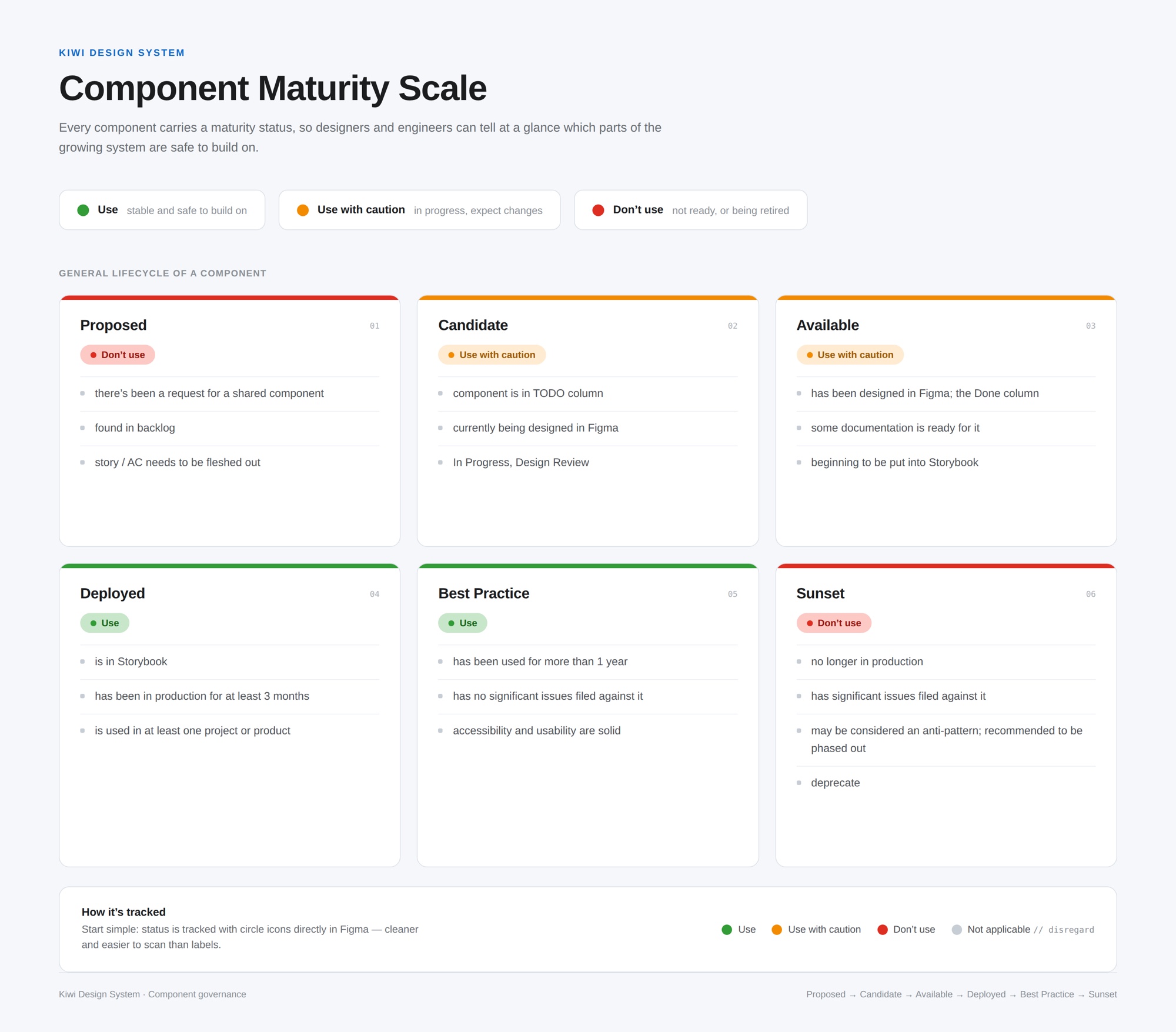
A design system only works if people trust which parts are safe to use. I introduced a component maturity scale so anyone, designer or engineer, could read a component’s status at a glance.
Each component moved through a defined lifecycle: Proposed, Candidate, Available, Deployed, Best Practice, and Sunset, with clear criteria for each stage. It turned Kiwi from a static library into something that could grow and retire pieces on purpose, without breaking the products that depended on it.
The Outcome
Release
The product was merging into one global platform, and Kiwi’s components went with it — with adoption ongoing. All eight development teams pull components from Storybook rather than rebuilding their own.
Legacy products were a deliberate non-goal. They were in upkeep mode, so we focused Kiwi on the current platform instead of retrofitting products that weren’t moving forward. Scoping legacy out wasn’t a compromise we settled for — it’s what let a small team ship a system the whole company could actually adopt.
Accessible from the start
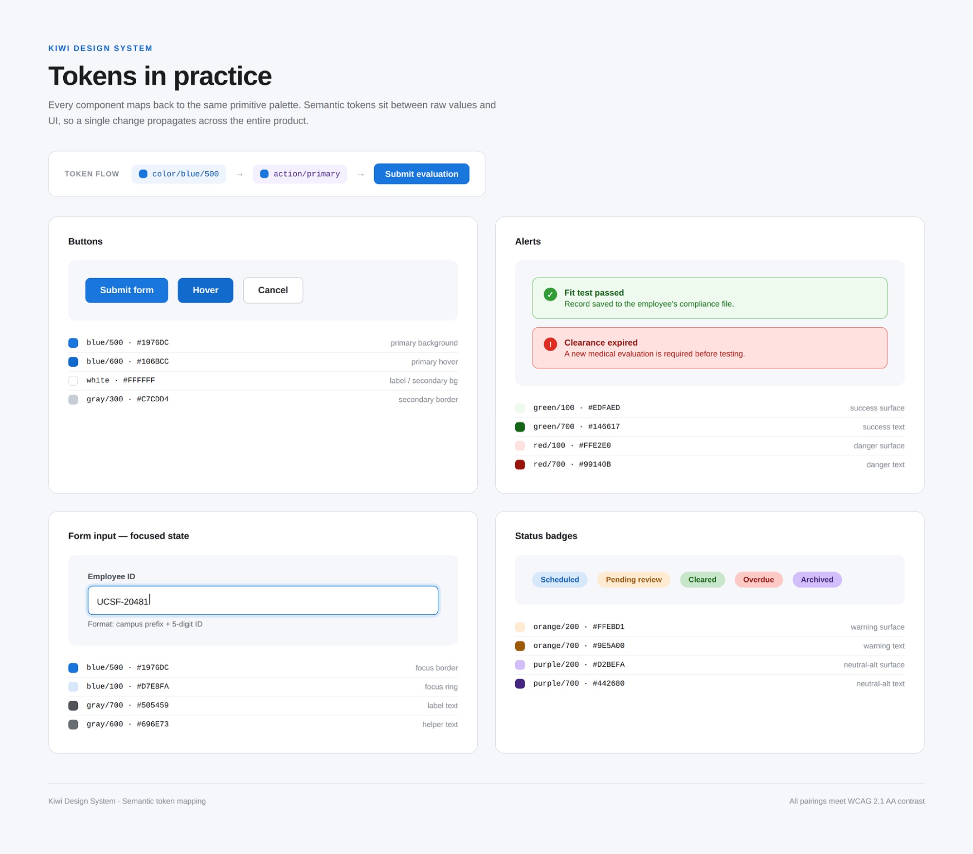
We followed WCAG 2.1 while designing components, not after — contrast was tuned at the token level, and I worked alongside one of our QAs to run checks on colour contrast, screen reader compatibility, focus visibility, and readability before the rollout. The palette evolved with those checks: specific hex values were pushed darker so real pairings pass, with the reasoning written down.
Project Learnings
1. A design system is not a deliverable.
I used to think a design system was a deliverable, and that we’d be done when the components existed. We weren’t. Instead, a design system is a product, and the library needs a way to track what’s safe to use — otherwise it drifts right back into the inconsistency it was meant to fix. The governance work turned out to be as much a part of the system as the components themselves.
2. Documentation has to live where the work happens.
We watched beautiful guidelines rot in Zeroheight before we learned this. One living source of truth next to the code beats polished documentation nobody can rely on — it’s not close.
3. Name things for the people who use them.
Does it really matter what our customers call them if our internal teams aren’t sure themselves? Tokens named the way engineers already think meant alignment stopped being a meeting and started being automatic. I learned to design for the person consuming the system, not just the end user of the product.
Wanna see more?
Want to hear more about how I ended up enjoying working in occupational health and safety? Not your typical mid-20s passion, but I’m more than happy to chat more about how I got here and my process over a call. Reach out to me at jasminevc99@gmail.com.